
Popcorn
Star Cinema, Hong Kong's (fictional) leading theatre chain, offers everything from blockbusters to indie films in its theatres. Popcorn is a dedicated mobile app for its subscribers/patrons — it allows them to easily browse movies, check reviews, and book tickets for current and upcoming shows.

Project Background
The primary objective of the Popcorn mobile app was to enhance the movie-going experience for Star Cinema's patrons. Through initial user research, it became evident that Star's website was primarily desktop-oriented, which limited the ability of users to spontaneously plan their cinema outings while on the move.
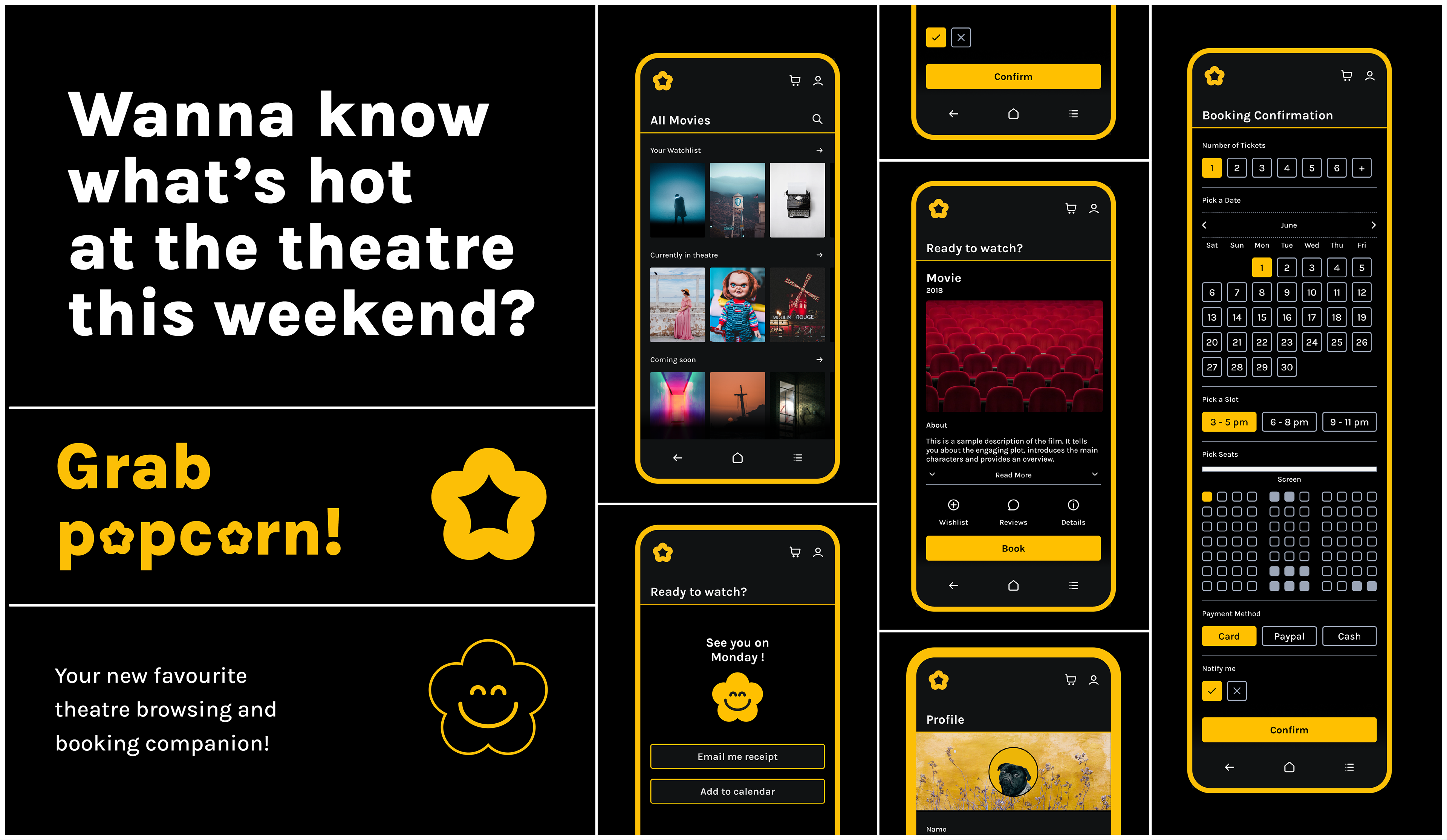
A poster introducing the popcorn companion app.
Insights from Competitive Audit
A competitive analysis revealed that similar companion apps typically offer movie browsing within the app. However, they commonly redirect users to external websites for movie details and seat reservations rather than integrating these features directly. This presents an opportunity for Popcorn to stand out by providing these functions within the app for a more streamlined user experience.
Project Goals
Keeping in view the limitations of the website and potential competitors - the new app was designed to (i) bring convenience and spontaneity to the booking process, (ii) allow users to easily browse movies, access reviews, and make bookings for current films within the app, and (iii) be notified of upcoming films within the Star ecosystem, effectively complementing the existing website.

Initial Wireframing
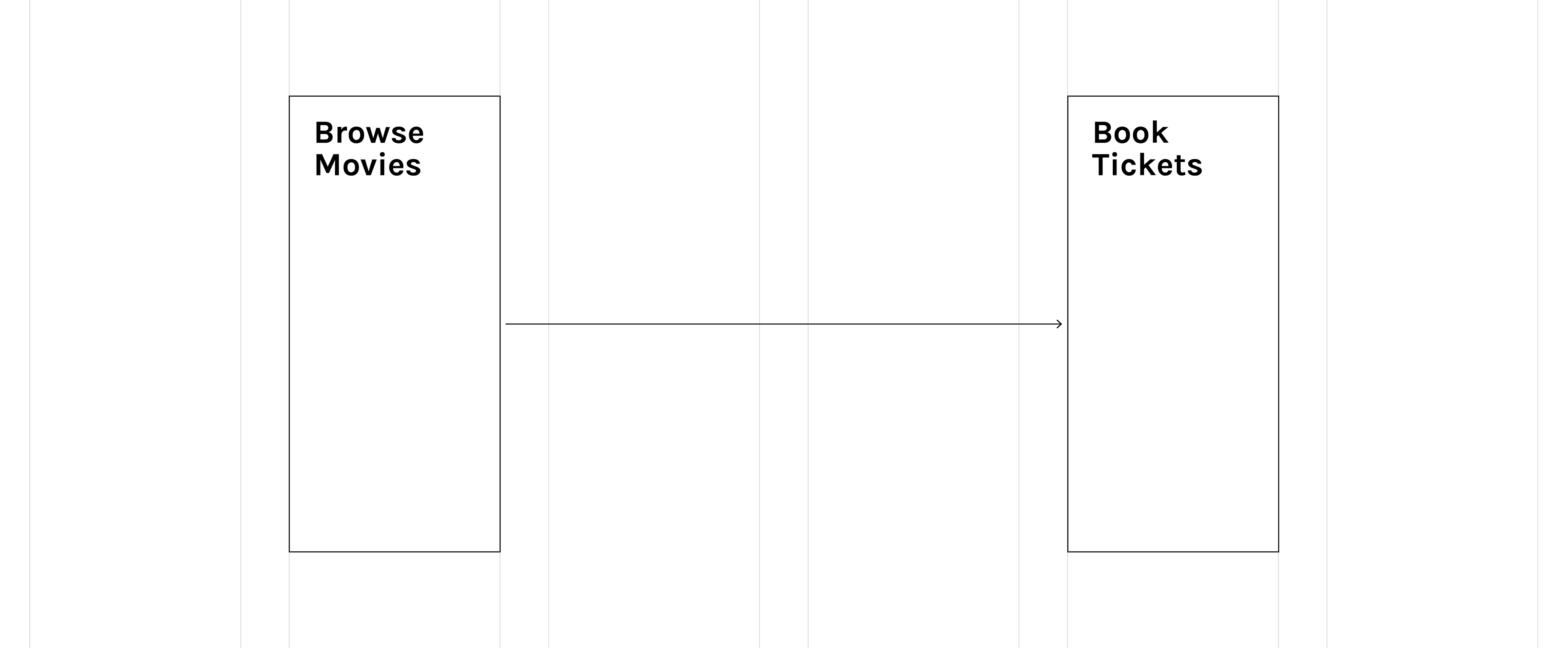
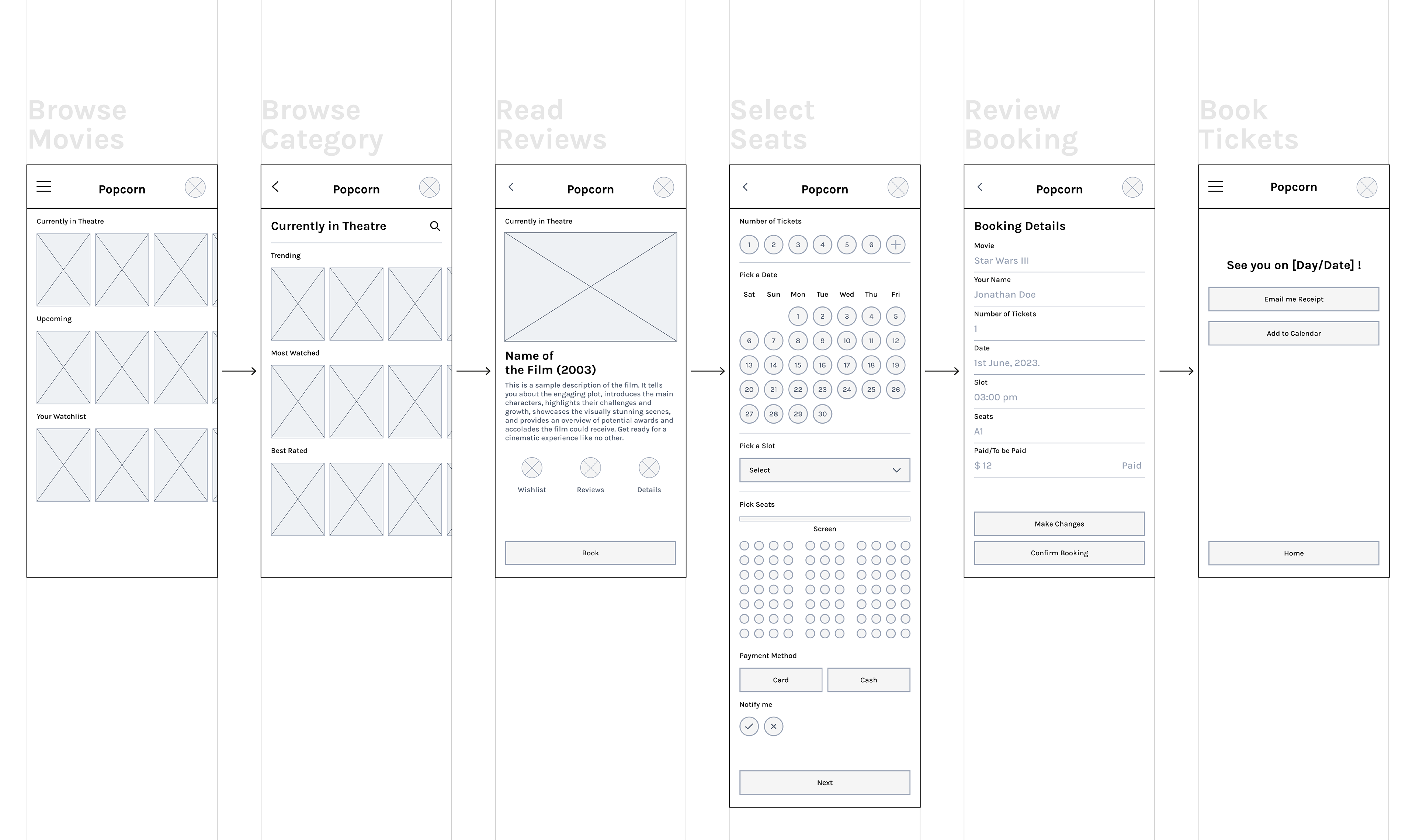
An initial wireframe has been created based on these insights. The wireframes below illustrate the key part of the user journey within the app - which allows the user to (i) browse movies, (ii) read reviews & movie details, (iii) select seats within the app, and (iv) book tickets. The user is then emailed with a receipt with a link to the payment.

User testing
User testing revealed key insights: (1) Users prioritise knowing what's currently playing and upcoming,(rather than knowing what's popular/trending) (2) they want easy access to a 'wishlist', (3) adding a filter for browsing is important, (4) seamless in-app payment with a cash option is preferred, (5) a booking confirmation page is essential, (6) users appreciate notifications for booked movies, and (7) calendar integration is a valuable feature.

Wire-framing (II)
A second round of wire-framing was done to reflect the user needs and preferences identified through our research and user testing.
Visual Identity
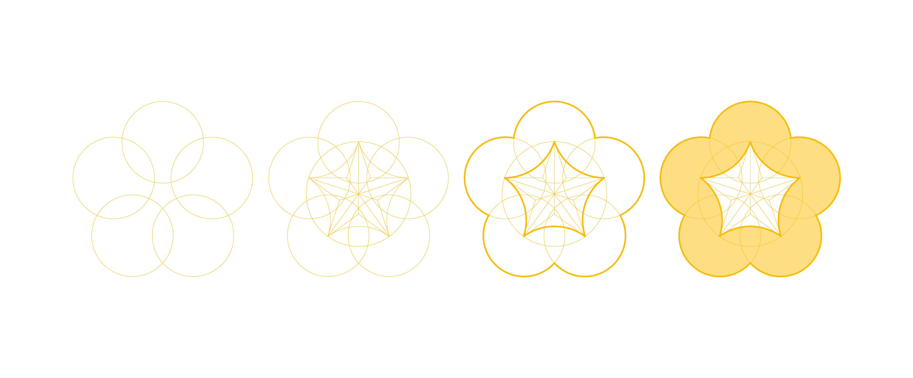
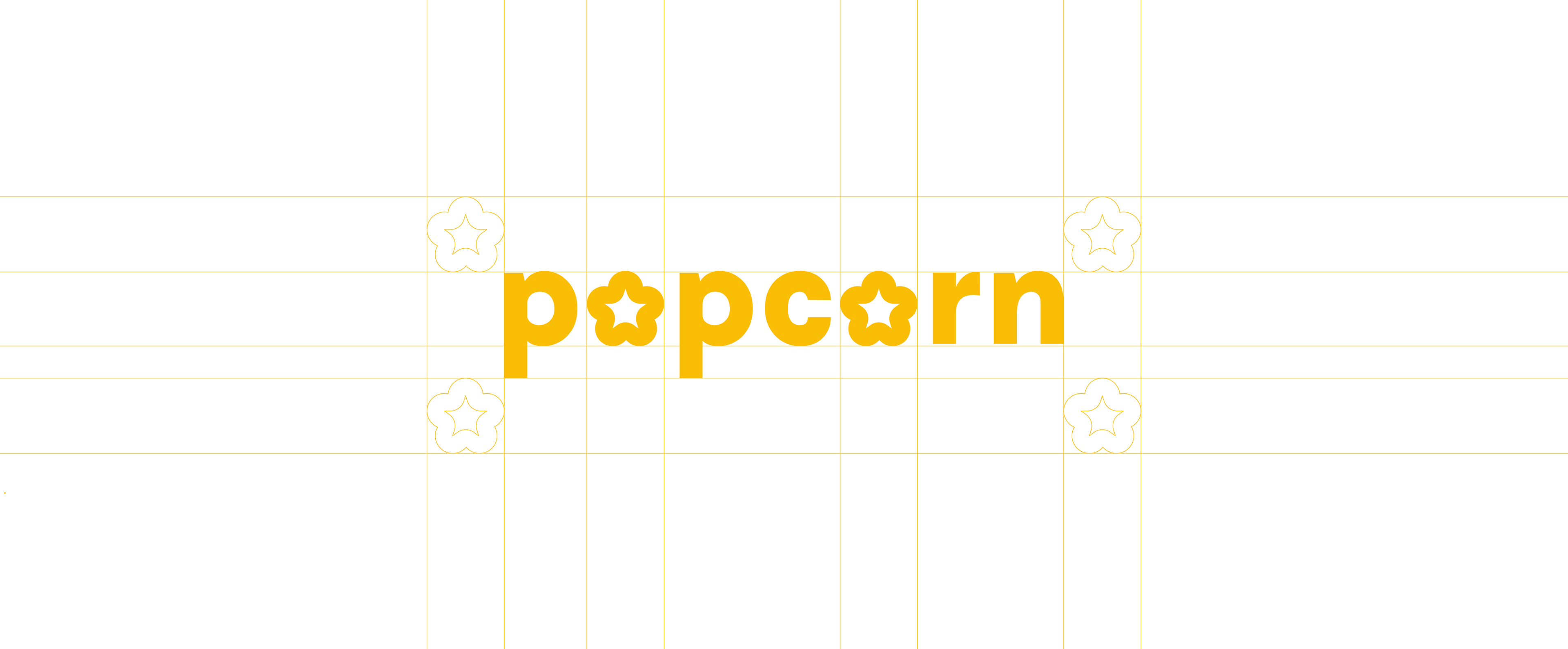
The Popcorn brand's visual identity features a simple and geometric icon, combining a single popcorn kernel with the 'Star' icon, a tribute to its owner, Star Cinema. This versatile logo, made of consistent curves, can seamlessly integrate with text and serves as a foundational element for the brand's style guide, ensuring a clean and cohesive look throughout.
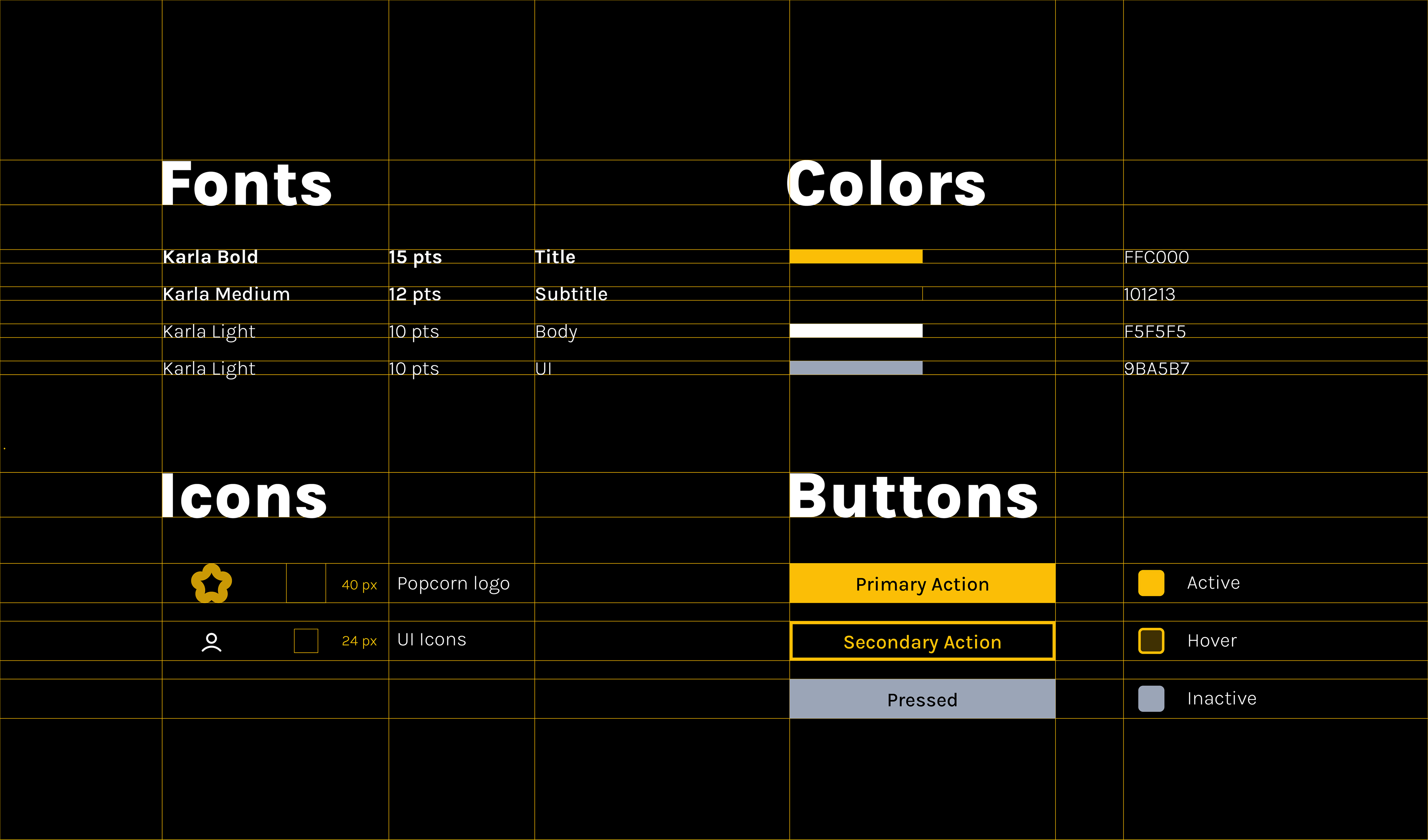
Style Guidelines
Black and golden yellow were chosen as primary colors for the Popcorn app. Black represents the cinematic atmosphere, while golden yellow signifies popcorn and the brand's connection to the 'golden' star. The design remains simple, devoid of gradients or embellishments - as the icon will be integrated with the app's user interface as a 'home' button, and therefore needs to be legible in smaller sizes. The app's limited colour palette (of 4) also ensures consistency across the app's various services. The choice of font was 'Karla' for its clean and simple design, complementing the logo's curves.


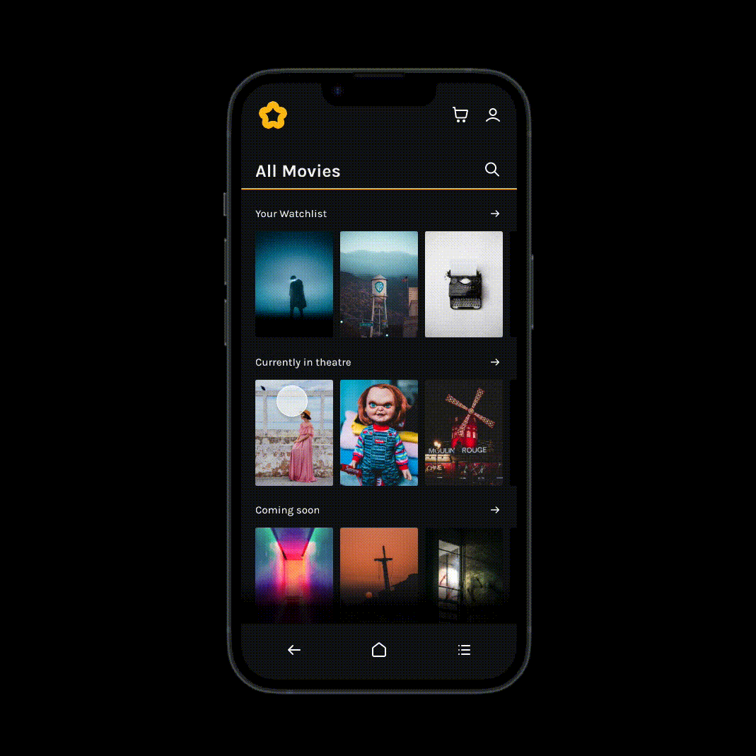
High Fidelity Prototype
The high-fidelity version of the app was designed to align with brand guidelines. The 'popcorn' icon became the home button, and all buttons were reshaped to echo the logo's curves. 'Line' icons were used for consistency. The app employs 'lines' and 'solids' to convey different information or functions consistently. The popcorn logo also inspired the creation of 'Pop,' a friendly companion within the app, ensuring a brand-conscious and user-friendly experience.
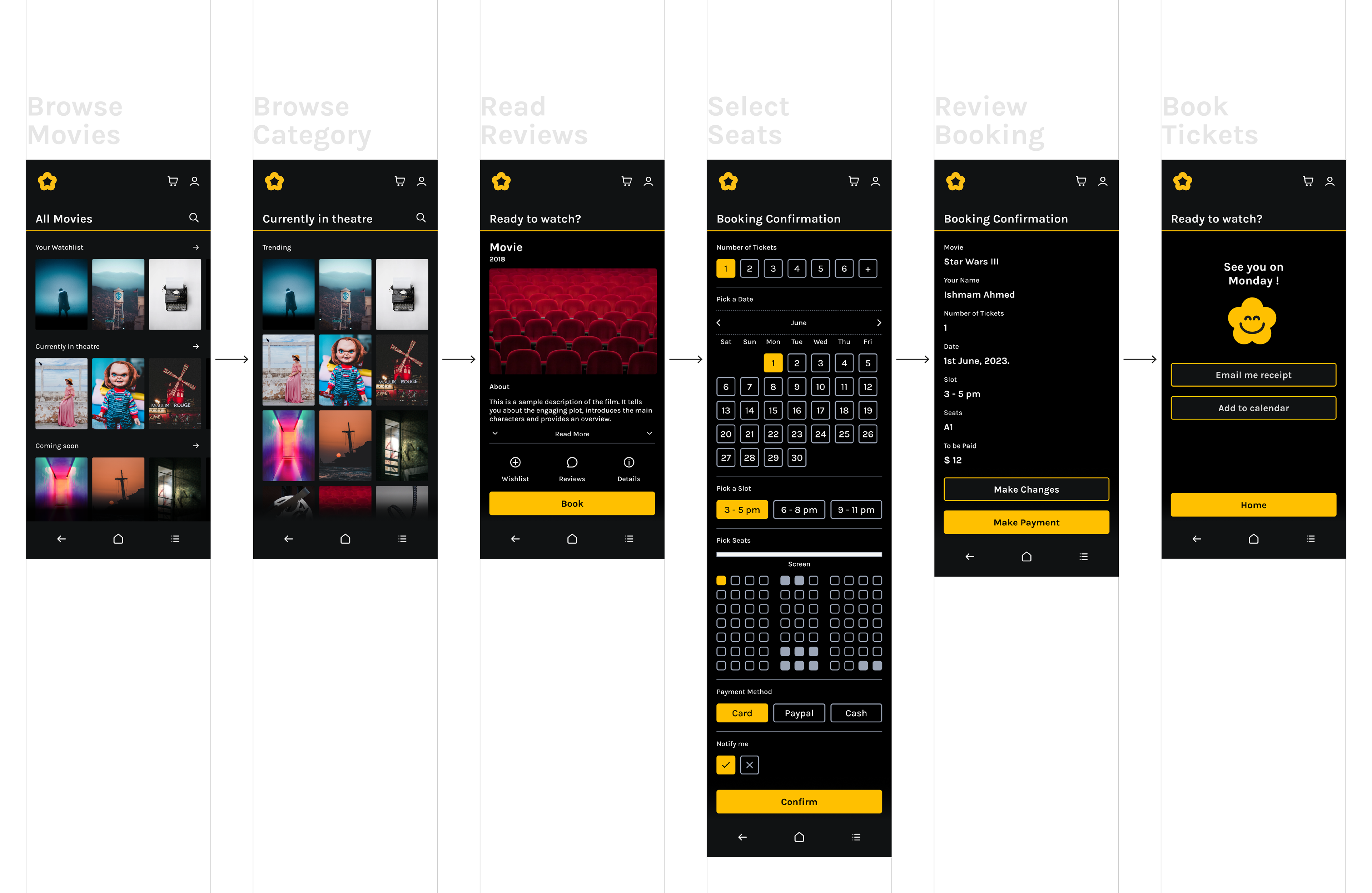
The app's core user journey - from browsing films, reading reviews/ratings, seat and slot selection, payment, and calendar integration - all within a single flow.

A set of key visual elements are consistently present in all screens, to guide users to access key functions conveniently.
Interaction
The interaction design of the app prioritizes simplicity, featuring straightforward gestures for intuitive navigation between screens. Clear action buttons and consistent visual elements guide users to access key functions conveniently, enhancing the overall user experience.
Communication and Collaterals
The visual identity, characterized by lines, solids, icons, and the 'Pop' companion, is consistently applied in the app, email newsletters, and marketing materials. This unified approach reinforces brand recognition and maintains a cohesive brand image across all communication channels.

Reflection
This was my capstone project for Google's UX Design and Research Specialisation Course. It challenged me to wear many hats and integrate various skills - from user research to diagramming to interface design and illustration - into one cohesive whole.
Through iterative testing with users (mostly my friends, and fellow course-mates) I discovered many valuable insights that shaped the design. Their feedback revealed unexpected usability issues and helped me (really) understand that effective design prioritises intuitive user experiences over aesthetics, and stunning visuals mean nothing if it doesn't get the job done.
This project also taught me the value of thorough design thinking and iterative development. As a perfectionist, iterative design is an uncomfortable process - but it's inescapable if you would like to build a product for other people and not just yourself.
Team
Ishmam Ahmed.